Types of Product Diagram with Examples for Product Managers


No matter how well you understand the product, you need to rely on language to communicate the idea to your stakeholders and end users. This reliance on language alone creates a risk of miscommunication and misalignment. In product development, words are often too linear to capture the non-linear complexity of what you’re building—ideas with layers, dependencies, loops, edge cases, and decision points. Communicating all that complexity effectively requires more than just well-chosen words.
A diagram is a compact visual language that strips away ambiguity and conveys functional meaning. In product and project management, it works as a way to make logic visible, structure concrete, and decisions shareable across roles, disciplines, and technical depths.
With product diagrams:
- Engineers understand the system flow,
- designers map the user pathways,
- stakeholders see the sequence,
- and missing elements become immediately visible.
In this article, we’ll explore product diagram examples and when and how to use them to turn good thinking into clear, collaborative execution.
What is a product diagram
Product diagram is a structured visual representation used to describe, analyze, and communicate the components and functionality of a product. In practice, product managers use these diagrams to externalize mental models, validate assumptions, and create a shared understanding during planning, development, and stakeholder communication.
") Diagram (Source: Freepik)
Diagram (Source: Freepik)What about flowcharts?
Flowcharts are one of the most widely used visual tools in product and engineering teams. They represent sequential processes, illustrating how a task flows from one step to the next using standardized symbols. While product diagrams focus on structure, systems, and relationships, flowcharts focus on logic and progression.
 Flowchart
We bring them into the conversation because many product managers start with flowcharts when mapping out workflows, decision trees, or user interactions. Understanding how flowcharts differ from—but complement—product diagrams helps teams choose the right tool for the right context.
Why are diagrams and flowcharts important
For product teams dealing with cross-functional complexity, diagrams and flowcharts compress ambiguity, clarify workflows, and make team decisions auditable. They work to:
- Create a source of continuity: Visual artifacts like diagrams and flowcharts provide a high-signal, low-noise trail of how things were designed to work. Whether onboarding a new engineer or running a retro, you need references that reflect reality, not outdated specs.
- Reduce time-to-context: Whether onboarding a new teammate or syncing with engineering, diagrams and flowcharts dramatically reduce the time it takes to grasp how things work. One diagram can replace multiple meetings or pages of documentation.
- Bridge system design with stakeholder clarity: Product managers operate between technical depth and business strategy. Diagrams flex across both in a way that’s detailed enough for engineers and digestible enough for execs—while flowcharts help communicate process logic in a clear, linear format.
- Unlock faster decision cycles: Without visual representations of workflows, architecture, or logic, teams spend cycles interpreting vague descriptions. Diagrams reveal what’s missing, what’s blocked, and where trade-offs live—while flowcharts make process dependencies and decision points immediately visible so product managers can decide and delegate with confidence.
Product diagrams clarify ideas, but where they are most effective is across the product lifecycle.
For product managers, every phase comes with a different kind of fog, like having prioritization without context or sprints that drift off course mid-cycle.
Suggested resource: 👉Product Lifecycle Management Template
The table below outlines how different types of diagrams apply in product workflows.
| Use Case | How Product Diagrams Help | When to Use |
|---|---|---|
| Feature prioritization flow | Show how user actions connect to value delivery across features | During roadmap planning |
| User journey mapping | Expose friction points, drop-offs, and emotional peaks in user experience | In UX research and design alignment |
| System architecture mapping | Illustrate component interaction, API calls, and service boundaries | During handoff from product to engineering |
| Workflow automation planning | Visualize triggers, conditions, and actions clearly, preventing logical conflicts | While setting up integrations or automations |
| Onboarding flow diagram | Simplify decision trees, ensuring new users take the right steps | For optimizing activation and retention |
| Sprint planning diagram (kanban/flow) | Track task status, ownership, and blockers | During sprint review or standups |
| Decision tree | Clarify tradeoffs, paths, and logic for feature inclusion/exclusion | When handling stakeholder tradeoffs |
Creating product diagrams and flowcharts
Creating a product diagram or flowchart begins well before anything is drawn. The first step is defining the use of the diagram, what exactly are you trying to clarify, align, or decide? Next, choose the diagram type based on the nature of the information. Use decision trees to explore logic paths, data flow diagrams for system architecture, journey maps for user experience, and workflows for task execution.
Once the format is chosen, sketch quickly and loosely. Whether on paper, a whiteboard, or a tool, the goal at this stage is to ensure you get the base structure right, not to create a perfect visual.
Interpreting product diagrams and flowcharts
Accurate interpretation means reading the diagram's elements in context. For example, "Is this a user-facing journey or a backend workflow, or are transitions linear, conditional, or parallel?"
While visual conventions may vary slightly by diagram type, some symbols are widely used:
- Rectangles typically indicate tasks, steps, or functions
- Diamonds represent decision points or conditionals
- Arrows define flow, sequence, or data movement
But those shapes don’t tell you what’s missing, and that is where the problems live. Find meaning in looking out for:
- Unlabeled transitions — unclear next steps or outcomes
- Dead ends — steps with no follow-up or owner
- Overloaded nodes — one step doing too much
- Circular logic — flows that trap users or data in loops
- Decision points without criteria — subjective, untestable choices
Types of product diagrams
Here are the types and accompanying examples of product diagrams and how each one uniquely sharpens product thinking and accelerates execution:
1. Data flow diagram
") Data flow diagram (Source: Canva)
Data flow diagram (Source: Canva)A data flow diagram (DFD) illustrates how data enters, flows through, and exits a system by capturing the interactions between users, processes, storage layers, and outputs.
It simplifies complex backend flows into standardized visual elements, using circles for processes, rectangles for external entities, and arrows to indicate the direction of data movement.
Example of a data flow diagram
In the example above, you can see a typical e-commerce transaction workflow. As a product manager, this DFD reveals the action sequence and also makes the invisible logic explicit:
- User actions trigger system responses, and each process node represents logic you may need to define, prioritize, or QA.
- Data connections become contracts, and every arrow shown represents a promise (or dependency) one system makes to another.
- External systems in the image translate to collaboration boundaries for product managers, which could mean platform teams managing payment services, data teams overseeing accounting pipelines, or operations managing fulfillment triggers.
When to use the data flow diagram
- Coordinating with data engineering or platform teams to ensure the correct input/output structure for services
- Documenting failure points and fallback logic for complex workflows
- Designing data integration workflows between internal systems and external APIs
Best for:
- Product managers working with data engineering, devOps, or platform teams
- Regulated industries (e.g., healthcare, finance) where data movement must be clearly documented for compliance.
Check out this Interdepartmental Data Flow Diagram template!
2. Swimlane diagram
") Swimlane diagram (Source: Canva)
Swimlane diagram (Source: Canva)A swimlane diagram is a type of flowchart that maps out a process across multiple stakeholders by organizing tasks into parallel lanes, with each one representing a team, role, or system. It’s a core tool in Business Process Model and Notation (BPMN) and is built for analyzing organizational processes, uncovering bottlenecks, and clarifying ownership.
Each action or decision is placed in its corresponding lane, revealing how work flows across functions and who owns it.
Example of a swimlane diagram
Take the example above, which shows a basic interdepartmental workflow. The diagram reveals:
- The customer lane initiating the process is framed by a start/end symbol (⬭), showing that the workflow begins externally.
- As tasks pass through Sales, Stocks, and Finance, each process symbol (▭) shows a discrete task, like checking inventory or processing a payment.
- The decision symbol (◇) introduces a logic gate ("Is the product in stock?"), splitting the flow based on outcome.
- Arrows track sequence, direction, and handoff, making both intra-lane steps and cross-lane dependencies crystal clear.
When to use the swimlane diagram
- If you are scoping feature rollout plans that involve phased deployment between product, DevOps, and analytics
- When mapping internal approvals for compliance features (e.g., data retention policies involving legal and infra)
- In situations where teams are stepping on each other’s toes or missing handoffs entirely, a swimlane diagram forces clarity around roles, responsibilities, and blockers
Best for:
- GTM teams, cross-functional squads, and support ops
- Especially valuable during pre-launch logistics or partner integration rollouts
3. Annotated process flows
") Annotated process flow diagram (Source: Department of Product)
Annotated process flow diagram (Source: Department of Product)An annotated process diagram is a standard flowchart enhanced with context. Instead of separate spec documents or meeting walkthroughs, annotations handle the narrative directly. Each step is marked numerically, with clear notes beneath to explain decisions, exceptions, or technical constraints.
Example of an annotated process flow diagram
The diagram above explains how a tokenized payment system works during checkout, using third-party processors like Stripe, Braintree, or PayPal. It includes:
- Arrows clearly showing data direction (card info outbound, token inbound).
- Service boundaries are marked by the user frontend, product backend, and third-party processor.
- Annotations make technical steps (like token storage and usage) understandable for both engineering and product stakeholders.
When to use the annotated process flow diagram
- Ideal for planning feature implementation that needs detailed logic behind every step
- For aligning cross-functional teams asynchronously, such as remote engineers, QA, or compliance
- In situations where clarity matters more than the visual, like reviewing approval flows or onboarding processes
Best for:
- Engineering, QA, compliance, and remote-first teams handling detailed flows
- API integrations and critical edge-case handling
4. Decision trees
") Decision tree (Source: Canva)
Decision tree (Source: Canva)A decision tree maps out the chain of outcomes that follow a single choice, making it easier to visualize logic branches, conditional paths, and their downstream effects. Its branching layout visually mirrors decision logic, making it one of the clearest ways to stress-test decisions before implementation.
Example of decision trees
In the example above, the question "Do I want to delegate this?" expands into multiple paths, each reflecting a specific scenario based on capability, timing, or role clarity. This mirrors how product decisions often work in practice:
- Should we build or buy?
- If a user abandons checkout, what happens next?
- What happens if usage spikes beyond the X threshold?
As the branches expand, this diagram reveals predictive models that help you think ahead of the cost of each decision path.
When to use a decision tree diagram
- If you are designing experimentation models, such as deciding which user segment sees a particular variation or flow
- Trying to define conditional rollouts like fraud detection paths or feature eligibility logic
- For mapping internal automation workflows for support, finance, or compliance teams that rely on rule-based handoffs and exceptions
- Figuring out customer success flows (“if support chat open > 5 mins, then escalate”)
Best for:
- Product and engineering teams aligning on logic complexity
- Data teams that model decisions based on behavioral inputs or system state
5. Empathy mapping
") Empathy map canvas (Source: Game Storming)
Empathy map canvas (Source: Game Storming)Most diagrams focus on making systems and workflows more legible, but some, like empathy maps, are designed to reveal the user’s inner experience. Empathy mapping tracks how users feel at different points in their journey and ties those emotions to their actions, thoughts, and friction points.
Example of empathy mapping
In the example, the map is structured as a seven-sectioned grid that helps teams visualize the behavior around a central user profile:
- Who are we empathizing with? Defines the specific user segment or persona, including their context, role, and situation.
- What do they need to do? Identifies goals, decisions, and outcomes that the user is responsible for, which is often tied to job-to-be-done logic.
- What do they see? Surfaces external influences, including the environment, competitors, and observable behaviors of others.
- What do they say? Captures direct quotes, verbal behavior, and imagined internal narratives.
- What do they do? Observes actual behavior, the actions taken, decisions made, and habits formed.
- What do they hear? Lists influence peers, media, teammates, or stakeholders, both directly and indirectly.
- What do they think and feel? Divided into Pains (fears, frustrations) and Gains (desires, hopes).
This map is compelling because it reveals emotional highs and lows, which traditional funnels often miss, and can highlight the root cause of drop-offs. It can inform UX, copy, and the timing of interactions or interventions to better align with user intent and mindset.
Empathy mapping is different from journey mapping, but both are critical in product development. They offer two sides of the same lens: one emotional, one operational.
| Aspect | Empathy Mapping | Journey Mapping |
|---|---|---|
| Focus | Capture the user’s internal experience through thoughts, emotions, and pain points | Map the external sequence, including steps, channels, and touchpoints |
| Purpose | Understand why users behave a certain way | Understand where and how users interact |
| Output Style | Present as a quadrant grid or emotional flow lines | Structure as a linear timeline with labeled stages |
| Best Used For | Analyze churn, rewrite UX, and identify emotional friction | Design workflows, clarify handoffs, and align cross-channel efforts |
| Stakeholders | Involve product, UX, and marketing teams | Involve product, CX, and operations teams |
When to use empathy mapping
- Analyzing why churn happens despite feature use
- Refining flows in industries where trust and emotion matter, like fintech (transaction anxiety), wellness (motivation cycles), or edtech (confidence building).
Best for:
- Product managers, UX researchers, and marketing strategists focused on retention, experience quality, or emotional engagement
6. Component interaction diagram
") Component interaction diagram (Source: Edrawmax)
Component interaction diagram (Source: Edrawmax)A component interaction diagram visualizes how discrete software components, including those in the frontend, backend, third-party APIs, and services, communicate with one another. It's a diagram that shows the relationships between these components, including how they pass data or messages.
Example of component interaction diagram
In the example above, a ride-sharing app is broken down into distinct actors and services: Rider, Admin, User, Car Types, Location, Firebase, Account systems, and checkout flows. You can immediately see:
- The direction of flow tells you which component initiates interactions and how data or control moves across the system,
- where user actions trigger backend logic, like fare selection leading to checkout and a Firebase update,
- and connections between components reveal contract boundaries; this shows what each service expects in return, what’s passed through, and where data gets persisted.
You don’t need to be an architect to use this, but it helps you speak in systems with your engineers, avoid surprises in implementation, and get ahead of integration issues.
When to use a component interaction diagram
- On coordinating frontend and backend teams on features that involve service calls, like fare calculation or payment flow
- If you are integrating third-party tools or refactoring systems and need to map clear service boundaries
- Onboarding engineers or PMs into a multi-service product, and want to accelerate their system understanding
- In scenarios where planning a rollout that spans multiple teams, services, or data touchpoints
Best for:
- Platform PMs, API-first product teams, SaaS applications
- Especially useful during refactoring, planning, or managing multi-service environments
Visual workflows vs Diagrams
Diagrams are critical for aligning mental models and communicating relationships and logic across a product’s ecosystem. However, they don’t manage ownership, progress, or change. That’s the role of a visual workflow.
| Aspect | Diagram | Workflow |
|---|---|---|
| Purpose | Communicates relationships within elements such as user journeys, system architectures, or data movements. | Defines and manages the actual sequence of tasks and processes that drive product development from inception to delivery. |
| Focus | Provides a static snapshot to facilitate understanding and communication. | Provides a dynamic, actionable sequence that governs how work progresses through various stages. |
| Interactivity | Illustrates a non-dynamic view used for planning and discussion. | Provides an interactive and operational system that allows tasks to be assigned, tracked, and automated. |
| Use Case | Works well for brainstorming sessions, architectural planning, and illustrating complex concepts. | Provides tools essential for managing sprints, tracking progress, and ensuring timely delivery of product features. |
A visual workflow maps the movement of work across teams, connecting planning, execution, and delivery into one operational view.
For example, a product diagram might outline how a bug escalates from support to QA to engineering. However, a workflow transforms that into a living process with task statuses, assignees, conditions, service-level agreements (SLAs), and transitions built in. Here, tools like Meegle make the workflow executable.
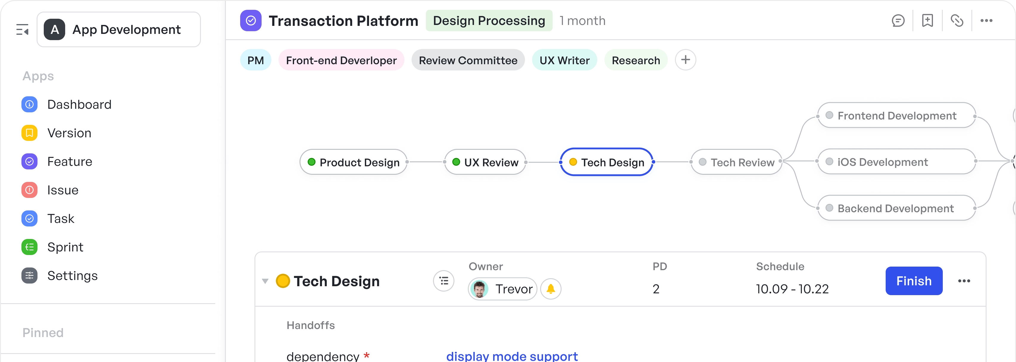
With its node-driven workflow engine, Meegle allows product teams to translate diagrams into actionable workflows. Each node represents a task or decision point, connected through defined inputs and outputs, mirroring the logical flow of product development processes. This visual approach ensures that every team member understands their role in the broader context, enhancing collaboration and efficiency.
") Meegle’s visual node-driven workflow (Understand the work context and execute your own tasks)
Meegle’s visual node-driven workflow (Understand the work context and execute your own tasks)How Meegle visualizes product management processes
To maintain execution speed without losing structure, product teams need more than diagrams; they need interfaces that visualize the current state of progress, ownership, and dependencies. Here’s how Meegle’s views help:
Table View
Meegle’s Table View functions like a real-time, editable requirements matrix but with the dynamism of a workflow engine built in. For product managers, this view replaces traditional, scattered spreadsheets with an interactive grid that adapts to different product stages and team structures.
 Meegle’s Table View
Here’s how product teams practically use Table View:
- Manage feature pipelines at scale: Whether you're tracking 10 features or 300, Table View provides you with a scrollable map of what’s in flight, what’s blocked, and where ownership gaps lie, without requiring you to dig through project boards or static documents.
- Prioritize clearly using filters and sorting: Product teams can sort by priority, business impact, or team ownership to focus execution on high-leverage work.
 Sorting feature on Table View
- Quickly align during roadmap reviews: With editable cells, custom columns, and frozen views, PMs can prepare custom views for roadmap alignment meetings, no separate presentation needed.
 Freezing a column to keep important information at the front of a table
Tree View
Meegle’s Tree View offers a top-down lens into how product initiatives break down from strategic goals to granular tasks. In a typical product lifecycle, roadmaps, features, and tickets are often managed separately, creating disconnects between strategy and execution. Tree View brings them into a unified hierarchy, making it easy to see overall alignment and trace progress, blockers, or ownership at every level.
 Meegle Tree View
Here’s how it functions like a system-level diagram:
- Map product strategy to execution: You can structure product goals → features → sub-tasks into a fully navigable breakdown. This helps translate strategy into delivery stages that are traceable and transparent across teams.
- Enable lightweight planning and fast navigation: The visual tree lets you add items and perform batch updates in context, without switching views.
 Cross-space tracking
Kanban View
Meegle’s Kanban View provides product managers with a clear, interactive board that reflects how work is actually progressing across teams, statuses, and streams. This board serves as a tactile, status-aware execution board, transforming complex workflows into manageable progress lanes.
 Meegle Kanban View
How it functions like a workflow diagram:
- Manage in-progress work across product streams: You are provided with a status-led layout of what’s in motion and what’s blocked. Each card is a live task, complete with owner, schedule, and current progress with no need to jump between views.
- Enable async status alignment for teams: Since each card holds key details (assignee, priority, timeline), stakeholders can understand progress and next steps without asking for a status update.
- Run agile rituals more efficiently: Meegle’s vertical and horizontal swimlane grouping adds powerful multi-dimensional visibility: view by priority and feature type, or by team and sprint status for up to three levels deep.
 Kanban View - horizontal swimlane
Gantt View
Meegle’s Gantt View visualizes how a product’s development unfolds over time, giving teams a timeline-aware map of every deliverable, dependency, and sprint milestone. While other views help visualize structure or flow, Gantt View adds the missing piece: duration, deadlines, and scheduling risk.
How it functions like a timeline diagram with operational depth:
- Each bar represents a work item, sprint, or subtask, showing when it starts, how long it lasts, and whether it’s on track.
- You can drag and drop blocks to adjust dates directly, providing hands-on control over timelines without switching views or spreadsheets.
- Meegle accounts for weekends, holidays, and non-working days in real time, so delivery dates always reflect realistic availability. This works well to reduce scheduling gaps and missed handoffs.
Product managers can use Meegle’s Gantt View to:
- Track task dependencies and sprint-level execution with Gantt View, which allows you to nest work items under epics or features, enabling you to see how tasks roll up over weeks or quarters. With Meegle’s default “Expand All Subtasks” setting, you can view every scheduling node and task linked to a requirement, or collapse the view to see only top-level delivery data. This flexibility enables easier tracking of execution at both macro and micro levels, without compromising visibility.
 A visual timeline of nested work items across a multi-phase product schedule
 Time ranges on Meegle’s Gantt View
- Model delivery scenarios and shift priorities: If you need to delay a feature but still meet the overall release deadline, you can shift one item’s block and instantly understand the downstream impact.
- Coordinate dependencies across teams: Product owners can manage interdependent tasks, particularly those involving backend/frontend integration, vendor integrations, or marketing coordination.
- Enable high-level progress reviews without additional documentation: For leadership or stakeholders, this view becomes your live roadmap layer, displaying the actual delivery status without requiring a separate report.
Charts
Meegle’s Charts transform work activity, quality signals, and team performance into real-time decision-ready insights.
How it functions like a diagnostic diagram:
- Build insights with zero overhead using 16+ out-of-the-box templates across two key modules: Quality Analysis and Requirement Efficiency.
 Chart templates
- Drill into layered data, e.g., start with feature-level velocity, then explore specific team contributions or sprint planning issues.
- Customize chart views by using filters like time, assignee, status, or business line. Then export or share presentation-ready reports with a single click.
 Customizable chart visualization
- Monitor performance metrics like delivery predictability, resource allocation, and progress deviations to catch issues early.
Product managers can use Meegle’s Charts to:
- Perform data drill-downs: From a high-level bar or pie chart, click through to deeper views showing task-level, sprint-level, or team-specific metrics. Ideal for PMs running retros or delivery reviews.
 Meegle Charts - data drilling
- Highlight real data: Focus stakeholders on what matters by greying out non-priority segments within ring charts, funnel diagrams, or combo charts, useful in roadmap reviews or planning discussions.
 Highlighting data in a ring chart
- Choose diverse chart types that fit: There’s a variety of visual representations, including area charts, bar graphs, pie charts, funnel diagrams, and more, to visualize effort breakdowns, burn-downs, or handoff efficiency. Perfect for sprint retrospectives, initiative health tracking, or team capacity forecasting.
 Diverse chart types
How to effectively map out workflows and product diagrams
Before choosing a diagram or building a workflow, you need to understand what you’re actually trying to clarify. Here are the three steps you can follow:
Step 1: Start with the question
What decision are you clarifying? Who needs to use or act on this? Define whether you're mapping user behavior, system logic, or a team process, and what ambiguity you’re trying to eliminate (e.g., unclear ownership, hidden task dependencies, decision friction). This helps clarify why you’re diagramming — to reduce mental strain and make the structure visible.
Step 2: Group by layer, then by function
Sort information into layers:
- User-facing → Journey maps, empathy diagrams
- Functional flows → Workflows, decision trees
- System logic → DFDs, architecture diagrams
Then clarify how the information behaves:
- Sequence? → Use a flowchart or Kanban board visualization
- State? → Use status-based workflow like Meegle’s
- Ownership? → Use swimlanes or Table View
- Dependency? → Use Tree or Gantt View
This structure enables the rapid and deliberate selection of the right diagram and, ultimately, the right workflow model.
Step 3: Draw the first draft with intent, not accuracy
Don’t aim for perfection but rather clarity. Use a whiteboard, sticky notes, or quick sketch tools to:
- Map core steps
- Flag unknowns (e.g., “What happens if X fails?”)
- Highlight data needs or friction points with colors or tags
Once sketched, refine it in Meegle’s workflow builder. Begin translating loose steps into structured stages with statuses, task types, and flags to turn your intent into a shareable workflow.
Step 4: Stress-test it with stakeholders
Run “What happens if…” scenarios to uncover edge cases and misaligned assumptions. Walk through the draft with the teams involved — product, engineering, ops, etc. — and let real-world project execution pressure shape the flow.
Use Meegle’s workflow collaboration tools to:
- Assign reviewers
- Tag blockers or gaps
- Collect inline feedback directly on stages
Step 5: Move from static to living
Most diagrams stop at the whiteboard, but product workflows shouldn’t. To remain useful, your diagram needs to be integrated into your team’s execution process.
Convert:
- Steps → assignable tasks
- Arrows → status transitions
- Notes → dependencies or automation flags
In Meegle, once the structure is validated, you can operationalize it instantly, apply owners, add project timelines, trigger automation, and visualize real-time status updates in the same flow you mapped.
Step 6: Use it as a strategic feedback loop
A well-designed workflow diagram facilitates continuous alignment. You can use it in:
- Standups → “Where are we in the flow?”
- Retros → “Which step broke?”
- Stakeholder syncs → “Here’s what’s working, here’s what’s stuck”
A deeper value of establishing this routine is that the workflow/architecture diagram becomes an alignment layer, allowing you to reference it weekly without needing to redraw it. Meegle gives you a visual canvas and live data. Status updates, blockers, and burndown points appear directly on the diagram, allowing you to course-correct in real-time.
Diagrams help you think. Workflows help you move. Meegle bridges both, turning your rough sketches and system logic into operational, trackable flows with live data, ownership, and outcomes. Instead of redrawing diagrams or duplicating effort across tools, you get a single space where structure and execution evolve together.
Visualise your product ideas clearly and collaboratively using Meegle’s intuitive tools.
FAQ
What are the most common mistakes to avoid when diagramming?
Some of the most common mistakes with drawing up a product diagram include overloading with detail, skipping context, or using the wrong format for the goal.
Can diagrams and workflows be combined?
Yes. Diagrams clarify structure, and workflows drive execution. Tools like Meegle enable you to convert diagrams into live workflows with tasks, owners, and status, bridging planning and delivery in one connected system.
How do I keep my diagrams relevant over time?
Integrate them into ongoing workflows. Use tools that update in real time, reflect current statuses, and allow feedback. Review regularly in standups or retros to ensure the diagram stays tied to reality.
Are product diagrams useful for non-technical teams?
Absolutely. Diagrams help non-technical teams understand dependencies, sequence, and ownership. They make abstract processes visible and create a shared language across product, marketing, support, and operations.
The world’s #1 visualized project management tool
Powered by the next gen visual workflow engineStart creating impactful work today