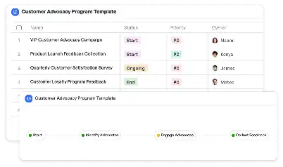
Data Annotation Quality Metrics Dashboard
Achieve project success with the Data Annotation Quality Metrics Dashboard today!

What is Data Annotation Quality Metrics Dashboard?
The Data Annotation Quality Metrics Dashboard is a specialized tool designed to monitor, evaluate, and improve the quality of data annotation processes. In industries like AI and machine learning, where annotated data is the backbone of model training, ensuring high-quality annotations is critical. This dashboard provides a centralized platform to track metrics such as accuracy, consistency, and completeness of annotations. For example, in a scenario where a company is training an autonomous vehicle model, the dashboard can highlight inconsistencies in annotated road signs, enabling teams to address errors promptly. By offering real-time insights and actionable data, the dashboard ensures that annotation teams can maintain the highest standards, ultimately leading to better-performing AI models.
Try this template now
Who is this Data Annotation Quality Metrics Dashboard Template for?
This template is ideal for data scientists, machine learning engineers, project managers, and quality assurance teams involved in data annotation projects. It caters to industries such as healthcare, autonomous vehicles, retail, and more, where annotated data plays a pivotal role. For instance, a healthcare company annotating medical images for diagnostic AI tools can use this dashboard to ensure annotations meet stringent quality standards. Similarly, an e-commerce platform tagging product images for search optimization can leverage the dashboard to maintain consistency across annotations. The template is also beneficial for annotation service providers who need to demonstrate quality metrics to their clients.

Try this template now
Why use this Data Annotation Quality Metrics Dashboard?
Data annotation projects often face challenges like inconsistent annotations, lack of transparency in quality metrics, and difficulty in identifying errors. The Data Annotation Quality Metrics Dashboard addresses these pain points by providing a clear and comprehensive view of annotation quality. For example, it can identify patterns of errors in specific annotators or datasets, allowing teams to take corrective actions. The dashboard also supports customizable metrics, enabling teams to focus on the aspects most critical to their projects. By using this template, organizations can ensure that their annotated data meets the required standards, reducing the risk of model underperformance due to poor-quality data.

Try this template now
Get Started with the Data Annotation Quality Metrics Dashboard
Follow these simple steps to get started with Meegle templates:
1. Click 'Get this Free Template Now' to sign up for Meegle.
2. After signing up, you will be redirected to the Data Annotation Quality Metrics Dashboard. Click 'Use this Template' to create a version of this template in your workspace.
3. Customize the workflow and fields of the template to suit your specific needs.
4. Start using the template and experience the full potential of Meegle!
Try this template now
Free forever for teams up to 20!
The world’s #1 visualized project management tool
Powered by the next gen visual workflow engine


