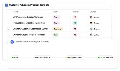
Churn Risk Heatmap Visualization Template
Achieve project success with the Churn Risk Heatmap Visualization Template today!

What is Churn Risk Heatmap Visualization Template?
The Churn Risk Heatmap Visualization Template is a powerful tool designed to help businesses identify and visualize customer churn risks. By leveraging data analytics and visualization techniques, this template provides a clear, color-coded heatmap that highlights areas of concern within customer segments. For industries like SaaS, telecom, and retail, understanding churn risk is critical to maintaining revenue and customer loyalty. This template simplifies the process by offering a structured framework to analyze churn factors such as engagement levels, purchase frequency, and customer satisfaction scores. With its intuitive design, businesses can quickly pinpoint high-risk areas and take proactive measures to mitigate churn.
Try this template now
Who is this Churn Risk Heatmap Visualization Template Template for?
This template is ideal for data analysts, customer success managers, and business strategists who are tasked with reducing churn rates. It caters to industries such as subscription-based services, retail, healthcare, and telecommunications, where customer retention is a key performance indicator. Typical users include SaaS product managers analyzing user engagement, telecom operators assessing service cancellation risks, and retail marketers identifying loyalty program effectiveness. By providing actionable insights, the Churn Risk Heatmap Visualization Template empowers professionals to make data-driven decisions and improve customer retention strategies.

Try this template now
Why use this Churn Risk Heatmap Visualization Template?
Customer churn is a significant challenge for businesses, often leading to revenue loss and increased acquisition costs. The Churn Risk Heatmap Visualization Template addresses this issue by offering a visual representation of churn risks, enabling businesses to identify patterns and trends. For example, a SaaS company can use the template to detect low engagement among users, while a retail business might identify declining purchase frequency in specific customer segments. The template's ability to integrate diverse data sources and present them in an easy-to-understand format makes it an indispensable tool for proactive churn management. By using this template, businesses can prioritize retention efforts, allocate resources effectively, and ultimately enhance customer satisfaction.

Try this template now
Get Started with the Churn Risk Heatmap Visualization Template
Follow these simple steps to get started with Meegle templates:
1. Click 'Get this Free Template Now' to sign up for Meegle.
2. After signing up, you will be redirected to the Churn Risk Heatmap Visualization Template. Click 'Use this Template' to create a version of this template in your workspace.
3. Customize the workflow and fields of the template to suit your specific needs.
4. Start using the template and experience the full potential of Meegle!
Try this template now
Free forever for teams up to 20!
The world’s #1 visualized project management tool
Powered by the next gen visual workflow engine


