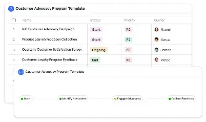
Data Visualization QA Protocol Template
Achieve project success with the Data Visualization QA Protocol Template today!

What is Data Visualization QA Protocol Template?
The Data Visualization QA Protocol Template is a structured framework designed to ensure the accuracy, clarity, and effectiveness of data visualizations. In the era of data-driven decision-making, visualizations play a critical role in communicating insights. However, poorly designed or inaccurate visualizations can lead to misinterpretation and flawed decisions. This template provides a step-by-step guide to quality assurance processes, including data validation, design consistency checks, and user feedback incorporation. By using this template, teams can standardize their QA processes, ensuring that every visualization meets the highest standards of quality and usability. For example, in a business intelligence context, this template can be used to verify that sales dashboards accurately represent data trends and are free from errors.
Try this template now
Who is this Data Visualization QA Protocol Template Template for?
This template is ideal for data analysts, visualization designers, quality assurance teams, and project managers who are involved in creating and reviewing data visualizations. Typical roles include business intelligence analysts ensuring the accuracy of dashboards, UX designers focusing on the usability of visualizations, and QA specialists tasked with identifying and resolving inconsistencies. Additionally, it is highly beneficial for organizations that rely heavily on data visualization for decision-making, such as marketing teams analyzing campaign performance, financial teams reviewing quarterly reports, and product teams tracking user engagement metrics.

Try this template now
Why use this Data Visualization QA Protocol Template?
Data visualization projects often face unique challenges, such as ensuring data accuracy, maintaining design consistency, and meeting user expectations. The Data Visualization QA Protocol Template addresses these pain points by providing a comprehensive checklist and workflow. For instance, it helps teams identify discrepancies between raw data and visualized outputs, ensuring that stakeholders receive reliable insights. It also standardizes design elements, such as color schemes and chart types, to enhance readability and user experience. Furthermore, the template facilitates iterative feedback loops, allowing teams to refine visualizations based on user input. By addressing these specific challenges, the template ensures that data visualizations are not only accurate but also impactful and user-friendly.

Try this template now
Get Started with the Data Visualization QA Protocol Template
Follow these simple steps to get started with Meegle templates:
1. Click 'Get this Free Template Now' to sign up for Meegle.
2. After signing up, you will be redirected to the Data Visualization QA Protocol Template. Click 'Use this Template' to create a version of this template in your workspace.
3. Customize the workflow and fields of the template to suit your specific needs.
4. Start using the template and experience the full potential of Meegle!
Try this template now
Free forever for teams up to 20!
The world’s #1 visualized project management tool
Powered by the next gen visual workflow engine


