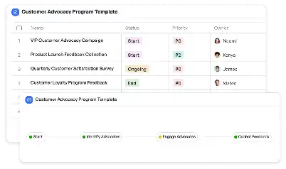
Canary Analysis Metrics Dashboard
Achieve project success with the Canary Analysis Metrics Dashboard today!

What is Canary Analysis Metrics Dashboard?
The Canary Analysis Metrics Dashboard is a specialized tool designed to monitor and evaluate the performance of canary deployments in software development. Canary deployments involve releasing a new version of software to a small subset of users to test its stability and performance before a full-scale rollout. This dashboard provides real-time metrics, such as error rates, latency, and throughput, to help teams identify potential issues early. By visualizing these metrics, teams can make data-driven decisions about whether to proceed with the deployment or roll back to a previous version. In industries like e-commerce, finance, and healthcare, where system reliability is critical, the Canary Analysis Metrics Dashboard plays a pivotal role in ensuring seamless updates without disrupting user experience.
Try this template now
Who is this Canary Analysis Metrics Dashboard Template for?
The Canary Analysis Metrics Dashboard template is ideal for DevOps engineers, software developers, and product managers who are involved in deploying and maintaining software systems. It is particularly useful for teams working in high-stakes industries such as fintech, where even minor disruptions can lead to significant financial losses. Typical roles that benefit from this template include site reliability engineers (SREs) who monitor system health, QA engineers who validate performance metrics, and project managers who oversee deployment timelines. Whether you are managing a microservices architecture or a monolithic application, this template provides the insights needed to ensure a smooth and reliable deployment process.

Try this template now
Why use this Canary Analysis Metrics Dashboard?
Using the Canary Analysis Metrics Dashboard addresses several critical pain points in the deployment process. For instance, one common challenge is identifying performance degradation early in the deployment cycle. This dashboard provides granular metrics that highlight even subtle issues, such as increased latency or error rates, allowing teams to take corrective action before they escalate. Another pain point is the lack of visibility into user impact during canary releases. The dashboard offers user-centric metrics, enabling teams to assess how changes affect end-user experience. Additionally, it simplifies the decision-making process by aggregating key performance indicators (KPIs) into a single, easy-to-read interface. This ensures that all stakeholders, from engineers to executives, have a clear understanding of the deployment's success or failure.

Try this template now
Get Started with the Canary Analysis Metrics Dashboard
Follow these simple steps to get started with Meegle templates:
1. Click 'Get this Free Template Now' to sign up for Meegle.
2. After signing up, you will be redirected to the Canary Analysis Metrics Dashboard. Click 'Use this Template' to create a version of this template in your workspace.
3. Customize the workflow and fields of the template to suit your specific needs.
4. Start using the template and experience the full potential of Meegle!
Try this template now
Free forever for teams up to 20!
The world’s #1 visualized project management tool
Powered by the next gen visual workflow engine


