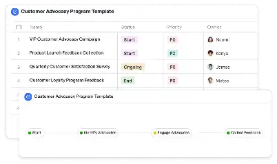
Price Elasticity Heatmap Visualization
Achieve project success with the Price Elasticity Heatmap Visualization today!

What is Price Elasticity Heatmap Visualization?
Price Elasticity Heatmap Visualization is a powerful tool designed to help businesses understand how changes in price affect the demand for their products or services. By leveraging heatmaps, this visualization method provides a clear and intuitive representation of price sensitivity across different customer segments, regions, or product categories. The heatmap uses color gradients to indicate areas of high and low elasticity, making it easier for decision-makers to identify trends and patterns. This tool is particularly valuable in industries like retail, e-commerce, and subscription services, where pricing strategies can significantly impact revenue and customer retention. For example, a retail chain can use this visualization to determine optimal pricing for seasonal products, ensuring maximum profitability while maintaining customer satisfaction.
Try this template now
Who is this Price Elasticity Heatmap Visualization Template for?
This template is ideal for professionals and teams involved in pricing strategy, market analysis, and revenue management. Typical users include pricing analysts, product managers, marketing strategists, and business consultants. For instance, a pricing analyst at an e-commerce company can use this template to analyze how discounts during a holiday season impact sales across different product categories. Similarly, a product manager in a subscription-based service can leverage this tool to evaluate the elasticity of various subscription tiers, helping them design more competitive pricing models. The template is also beneficial for consultants working with clients to optimize pricing strategies and improve market positioning.

Try this template now
Why use this Price Elasticity Heatmap Visualization?
The Price Elasticity Heatmap Visualization template addresses several key challenges in pricing strategy. One common pain point is the difficulty in identifying price sensitivity across diverse customer segments. This template solves this by providing a visual representation of elasticity, enabling users to pinpoint areas where price adjustments can yield the highest impact. Another challenge is the complexity of analyzing large datasets to derive actionable insights. The template simplifies this process by integrating data visualization techniques, making it easier to interpret and communicate findings. Additionally, it helps businesses avoid the risks associated with overpricing or underpricing, such as lost revenue or diminished customer loyalty. By using this template, teams can make data-driven pricing decisions that align with their strategic goals, ultimately enhancing profitability and market competitiveness.

Try this template now
Get Started with the Price Elasticity Heatmap Visualization
Follow these simple steps to get started with Meegle templates:
1. Click 'Get this Free Template Now' to sign up for Meegle.
2. After signing up, you will be redirected to the Price Elasticity Heatmap Visualization. Click 'Use this Template' to create a version of this template in your workspace.
3. Customize the workflow and fields of the template to suit your specific needs.
4. Start using the template and experience the full potential of Meegle!
Try this template now
Free forever for teams up to 20!
The world’s #1 visualized project management tool
Powered by the next gen visual workflow engine


