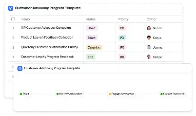
Responsive Breakpoint Configuration Template
Achieve project success with the Responsive Breakpoint Configuration Template today!

What is Responsive Breakpoint Configuration Template?
A Responsive Breakpoint Configuration Template is a structured framework designed to streamline the process of defining and implementing breakpoints in responsive web design. Breakpoints are specific screen widths where a website's layout adjusts to provide an optimal viewing experience across devices. This template is particularly valuable for web developers and designers who aim to create seamless user experiences on mobile, tablet, and desktop devices. By using this template, teams can standardize their approach to responsive design, ensuring consistency and reducing the risk of errors. For instance, in a scenario where an e-commerce website needs to cater to both mobile shoppers and desktop users, this template provides a clear roadmap for defining breakpoints, testing layouts, and deploying responsive designs efficiently.
Try this template now
Who is this Responsive Breakpoint Configuration Template Template for?
This template is ideal for web developers, UI/UX designers, and project managers involved in responsive web design projects. Typical roles include front-end developers who need to implement CSS media queries, designers who create mockups for various screen sizes, and quality assurance testers who validate the responsiveness of a website. Additionally, businesses that frequently update their websites or launch new digital products can benefit from this template to maintain a consistent and user-friendly design across all devices.

Try this template now
Why use this Responsive Breakpoint Configuration Template?
The Responsive Breakpoint Configuration Template addresses specific challenges in responsive web design, such as inconsistent layouts, poor user experiences on certain devices, and time-consuming testing processes. By using this template, teams can predefine breakpoints based on user analytics, ensuring that the most common screen sizes are optimized. For example, a retail website might struggle with high bounce rates on mobile devices due to poorly configured layouts. This template provides a systematic approach to identify and fix such issues, ultimately enhancing user satisfaction and conversion rates. Furthermore, it simplifies collaboration between designers and developers by offering a shared framework for responsive design implementation.

Try this template now
Get Started with the Responsive Breakpoint Configuration Template
Follow these simple steps to get started with Meegle templates:
1. Click 'Get this Free Template Now' to sign up for Meegle.
2. After signing up, you will be redirected to the Responsive Breakpoint Configuration Template. Click 'Use this Template' to create a version of this template in your workspace.
3. Customize the workflow and fields of the template to suit your specific needs.
4. Start using the template and experience the full potential of Meegle!
Try this template now
Free forever for teams up to 20!
The world’s #1 visualized project management tool
Powered by the next gen visual workflow engine


