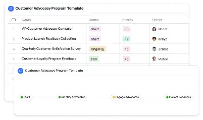
UI Breakpoint Adaptation Plan Template
Achieve project success with the UI Breakpoint Adaptation Plan Template today!

What is UI Breakpoint Adaptation Plan Template?
The UI Breakpoint Adaptation Plan Template is a structured framework designed to help developers and designers create responsive user interfaces that adapt seamlessly across various screen sizes and devices. In today's digital landscape, where users interact with applications on smartphones, tablets, desktops, and other devices, ensuring a consistent and optimized user experience is paramount. This template provides a systematic approach to identifying breakpoints, defining design adjustments, and implementing code changes to achieve fluid and adaptive layouts. By leveraging this template, teams can streamline the process of breakpoint analysis, design adaptation, and testing, ensuring that their applications meet the diverse needs of their audience.
Try this template now
Who is this UI Breakpoint Adaptation Plan Template Template for?
This template is ideal for UI/UX designers, front-end developers, and project managers working on responsive design projects. It caters to professionals in industries such as e-commerce, healthcare, education, and SaaS platforms, where cross-device compatibility is crucial. Typical roles that benefit from this template include design leads who need to ensure visual consistency, developers tasked with implementing adaptive layouts, and QA testers responsible for validating functionality across devices. Whether you're building a mobile-first application or optimizing an existing platform for multiple screen sizes, this template provides the tools and guidance needed to succeed.

Try this template now
Why use this UI Breakpoint Adaptation Plan Template?
The UI Breakpoint Adaptation Plan Template addresses specific challenges faced during responsive design projects, such as identifying optimal breakpoints, managing design complexity, and ensuring cross-device compatibility. For instance, e-commerce platforms often struggle with maintaining usability on both mobile and desktop devices. This template provides a clear roadmap for analyzing user behavior, defining breakpoints, and implementing design changes that enhance the shopping experience. Similarly, healthcare portals require seamless navigation across devices to ensure accessibility for patients and providers. By using this template, teams can overcome these challenges, reduce development time, and deliver high-quality, adaptive user interfaces tailored to their audience's needs.

Try this template now
Get Started with the UI Breakpoint Adaptation Plan Template
Follow these simple steps to get started with Meegle templates:
1. Click 'Get this Free Template Now' to sign up for Meegle.
2. After signing up, you will be redirected to the UI Breakpoint Adaptation Plan Template. Click 'Use this Template' to create a version of this template in your workspace.
3. Customize the workflow and fields of the template to suit your specific needs.
4. Start using the template and experience the full potential of Meegle!
Try this template now
Free forever for teams up to 20!
The world’s #1 visualized project management tool
Powered by the next gen visual workflow engine


