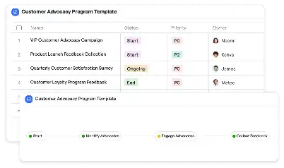
Component Library Usage Policy Template
Achieve project success with the Component Library Usage Policy Template today!

What is Component Library Usage Policy Template?
A Component Library Usage Policy Template is a structured document designed to outline the rules, guidelines, and best practices for utilizing a component library within a project or organization. Component libraries are collections of reusable UI elements, code snippets, or design assets that streamline development and design processes. This template ensures that all team members adhere to consistent standards, reducing redundancy and promoting efficiency. For instance, in a software development environment, a component library might include pre-built buttons, forms, and navigation bars. Without a clear usage policy, teams may misuse or over-customize these components, leading to inconsistencies and technical debt. By implementing a Component Library Usage Policy Template, organizations can maintain design integrity, ensure compatibility, and foster collaboration across teams.
Try this template now
Who is this Component Library Usage Policy Template for?
This template is ideal for product managers, UI/UX designers, software developers, and quality assurance teams who work with component libraries. It is particularly useful for organizations that rely on design systems or reusable codebases to accelerate project timelines. For example, a product manager can use the template to define the scope of component usage, while a designer can ensure that visual elements align with brand guidelines. Developers benefit by understanding the technical constraints and integration points of each component, and QA teams can use the policy to validate adherence to standards during testing. Whether you are part of a startup building a new app or a large enterprise managing multiple projects, this template provides a clear framework for component library governance.

Try this template now
Why use this Component Library Usage Policy Template?
Using a Component Library Usage Policy Template addresses several pain points specific to managing component libraries. One common issue is the lack of clarity around component ownership, which can lead to duplicated efforts or conflicting updates. This template provides a structured approach to assign ownership and define update protocols. Another challenge is ensuring cross-platform compatibility, especially when components are used in both web and mobile applications. The template includes guidelines for testing and validation to mitigate such risks. Additionally, it helps prevent over-customization, which can compromise the reusability of components. By standardizing usage practices, the template ensures that components remain scalable, maintainable, and aligned with organizational goals.

Try this template now
Get Started with the Component Library Usage Policy Template
Follow these simple steps to get started with Meegle templates:
1. Click 'Get this Free Template Now' to sign up for Meegle.
2. After signing up, you will be redirected to the Component Library Usage Policy Template. Click 'Use this Template' to create a version of this template in your workspace.
3. Customize the workflow and fields of the template to suit your specific needs.
4. Start using the template and experience the full potential of Meegle!
Try this template now
Free forever for teams up to 20!
The world’s #1 visualized project management tool
Powered by the next gen visual workflow engine


