What Is a Product Management Dashboard?


It’s 10 AM. You’re toggling between Slack, spreadsheets, Jira, and a dozen browser tabs just to answer one question: How’s the product doing?** Yet, this is the daily reality for many product managers who rely on product analytics.
Nearly three-quarters of product professionals say they’re trying to consolidate tools to standardize work across teams, while 48% cite lack of visibility and data silos (Source: ProductPlan’s 2024 State of Product Management report) as key blockers. The result? Waste of time, distorted priorities, and reactive decisions. This, in turn, affects overall customer satisfaction.
To translate data sprawl into decisive action, you need a product management dashboard—a central, real-time view that unifies insights and accelerates decision-making. Meegle offers exactly that. It offers a fully customizable dashboard that connects your data, aligns your team, and keeps everything visible in real time, right where you need it.
What is a product management dashboard?
A product management dashboard is a centralized, real-time visual tool that consolidates all essential product data—such as KPIs, progress tracking, goals, and team workflows, into a single, visual, real-time view. You stop relying on disconnected updates and start working with actual product insights that help you move forward.
Why product teams need a product dashboard?
Product teams manage complex workflows across engineering, design, marketing, and customer success—often without a clear, shared view of progress. A product management dashboard brings clarity. For example, when engineering velocity drops, the dashboard helps product managers spot it early, connect it to delayed feature launches, and adjust roadmaps accordingly.
Here’s how.
Overcoming fragmentation across teams and tools
Most product teams use different tools for roadmapping, sprint tracking, customer feedback, and analytics. Each tool contains valuable data, but without a central view, that information stays locked away in separate systems.
Suggested read: 👉7 Product Roadmap Examples to Guide Your Strategy
Team members frequently switch between platforms, copy-paste data, and overlook critical updates or dependencies. As a result, progress slows, decisions lag, and accountability fades.
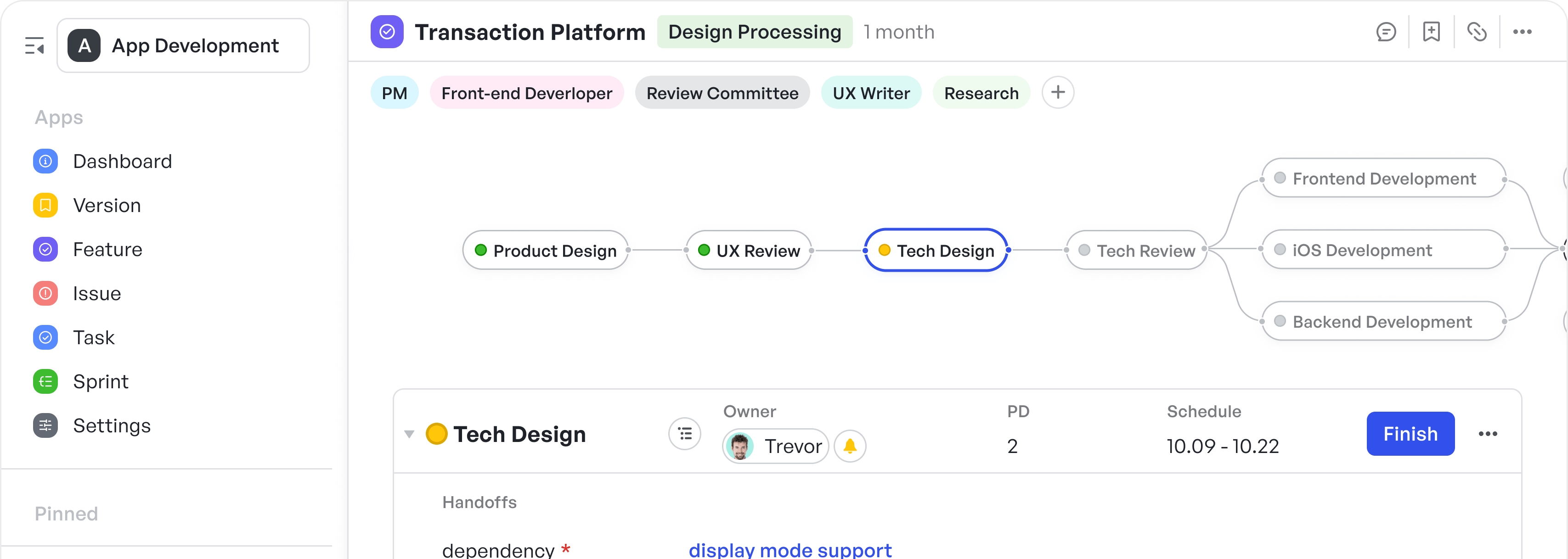
 Customizable dashboard in Meegle
A central dashboard provides your entire team with a single source of truth. Developers track progress, designers follow timelines, and product leads monitor goals, without constant pings, updates, or status calls.
Tracking sprint health and velocity with actionable reports
Product managers need to know how their sprints are performing at any given moment. Is the team moving at the right pace? Are blockers slowing things down? Traditional tools may show completed tasks or burndown charts after the fact, but they don’t always give real-time insight into how execution is unfolding.
Dashboards address this gap by surfacing live metrics, such as velocity, lead time, and cycle time. You can track trends sprint-over-sprint and spot risks before they snowball. If one story takes twice as long as planned, you catch the delay before it cascades. Similarly, if QA gets backlogged, you notice early through data points while there’s still time to resolve it.
Charts and summaries can be automatically sent to relevant stakeholders on a recurring basis, providing everyone with timely visibility without requiring manual effort.
The platform also offers pre-built dashboard templates, each with relevant charts already configured to track sprint metrics like velocity, lead time, and cycle time.
Plus, track sprint velocity, burn-up and burn-down rates, lead time, cycle time, and cumulative flow in real time. See how much work remains, where time is spent, and how the pace evolves with each sprint. Because when everyone sees the same metrics in real time, sprints stay on track and surprises disappear.
Understanding feature adoption and customer impact
A new feature launch doesn’t equal success—especially if adoption rates flatline post-release. Product managers need clear insights into which features users love, which ones underperform, and how usage evolves over time.
 Feature performance at a glance
Without this data, you’ll waste valuable development cycles on underperforming features.
Dashboards can pull in data from your analytics tools and show trends in user behavior. You can:
- Compare adoption across releases
- Measure churn post-launch
- Flag drops in engagement
Meegle's issue resolution template helps by capturing real-time customer feedback, automatically categorizing and prioritizing issues like bugs or low adoption signals. This ensures teams can identify problems quickly and track resolution progress.
This context helps you plan the next iteration based on real usage, not assumptions.
Keeping strategic goals and execution connected
Teams hit sprint milestones but miss business outcomes because OKRs live in one tool, and tasks in another. Nobody knows if today’s work truly supports broader objectives.
A good dashboard connects day-to-day execution with quarterly targets. It tracks key results alongside in-progress work so teams can stay focused on the bigger picture. You know what’s working, what’s lagging, and where to double down, such as prioritizing features that boost average revenue per user (ARPU).
 Set up product milestones and define objectives
Instead of jumping between the tools, Meegle makes this easy through a built-in OKR management solution that connects long-term goals with real-time work. You define objectives and key results (OKRs) and set checkpoints. You can tie each initiative to metrics like feature completion rate or user adoption, so progress is visible and trackable.
Drive day-to-day execution without losing context
A day in the life of a product team includes backlog management, story refinement, and sprint planning. Without a broader view, teams focus too much on completing tasks and prioritize quick wins over long-term impact without realizing it. Work continues, but no one checks if it actually moves the product forward.
You need a way to switch effortlessly between high-level goals and sprint-level execution. A strong dashboard helps you do that. Meegle provides your team with this exact setup through a system that tightly integrates sprint planning, product backlogs, and roadmaps. You collect all potential features in one shared space using product analytics tools. Team members then add context, assess value, and tag priority based on strategic direction.
 Gather and prioritize features for the product backlog
During sprint planning, the team reviews each feature and ranks them based on importance and impact. Meegle lets you rank features, tag urgency, and convert decisions into sprint-ready action items.
Types of product dashboards (with examples)
Different teams need different lenses to work effectively. Below are five types of product dashboards, each serving a unique purpose and built around different teams and their functions. .
Product metrics dashboard
You can use this dashboard to track how users interact with your product over time. You focus on metrics like:
- Daily active users (DAU)
- Monthly active users (MAU)
- Activation rates
- Feature adoption
- Churn rate
- Net promoter score (NPS)
When you track these consistently, you identify behavior patterns and flag potential drop-offs before they affect retention. For example, if you notice a spike in churn after a new feature release, you dig into usage data for that feature. Suppose adoption lags, yet feedback volume rises. That mismatch signals usability issues.
You bring that insight to design and engineering, then retest after deploying fixes. You also compare NPS trends before and after the release to validate the improvement. This dashboard gives you a performance baseline and lets you react to product usage shifts fast.
Let’s say you launch a new onboarding flow and notice a jump in DAU, but activation rates barely move. That tells you users are engaging, but something’s breaking in the experience before they commit. You bring this to your product team to rethink the activation journey, and not just surface-level UI tweaks.
To map those changes across teams, track cycles, and manage delivery, you need a structured way to monitor feature performance from concept to rollout.
Meegle’s Feature Management Template empowers teams to manage the full lifecycle of a feature, from planning and scoping to release and impact analysis. Built for agile squads, R&D units, and project owners, the template helps you:
- Visualize the complete feature development cycle
- Coordinate across product, design, and engineering
- Track real-time progress with granular metrics
- Automate recurring updates to boost team velocity
 Plan, prioritize, and monitor product features efficiently using Meegle’s feature management template
Suggested read: 👉11 Product Management KPIs in 2025 [+ How to Track Them]
Product health dashboard
A product health dashboard gives you a real-time view of your product’s stability, performance, and operational risks. It helps you monitor:
- Open bugs
- Rising technical debt
- System error rates
- System health
- Workload distribution across engineering and QA teams
- Incidents per sprint or release
You can also track ignored test failures or skipped code reviews that build up invisible debt over multiple sprints.
Let’s say velocity stays consistent, but your bug backlog keeps growing despite no changes in development output. You check incident response times and spot delays that point to an overloaded QA or DevOps team. That signals immediate risk, so you reduce scope for the next sprint and unblock critical paths.
In another case, automated test failures keep getting skipped in sprint reports. Over time, these invisible risks compound and delay major releases. This dashboard flags those hidden blockers that aren’t always visible in usage or metric-based dashboards.
Compared to product usage dashboards that focus on user behavior, this one zeroes in on the underlying infrastructure and delivery health, so you prioritize fixes that protect long-term performance.
Meegle’s Project Life Cycle Template helps you manage your product through five essential stages—Initiation, Planning, Execution, Monitoring and Controlling, and Closing—by offering a clear structure and workflows to follow at every step. This lets teams move faster, collaborate better, and deliver stable products that withstand the pressure of scale.
 Manage each project phase efficiently to drive success
Product launch dashboard
A product launch dashboard coordinates every task across product, marketing, sales, and support during critical release windows. Within a single view, it helps you track:
- Checklist completion
- Content readiness
- Beta feedback
- QA sign-off
- Final stakeholder approvals
 Coordinate product, marketing, sales, and support tasks seamlessly
According to Product School, a comprehensive checklist for product launch readiness encompasses tasks like infrastructure review, product documentation, pricing strategy, and sales training and strategy.
Suppose you’re launching a major pricing update. Your dashboard shows product documentation at 80% and sales enablement material is still under review. Marketing already scheduled the campaign, which exposes a risk if core assets don’t move in time.
You reassign content owners, accelerate review cycles, and shift email timing by 48 hours to avoid confusion. You don’t guess launch readiness as the dashboard exposes every gap across cross-functional dependencies. Once all items turn green, the team proceeds confidently, knowing that nothing has been missed at the last minute.
For a structured approach to managing marketing tasks and assets during a product launch, you can use the Meegle Marketing Plan Template. This template streamlines the marketing planning process into a standard visualized workflow, integrating an assets hub for seamless collaboration. It's designed for teams such as marketing managers, content creators, and digital specialists to coordinate launch strategies and material preparedness effectively.
 Visualize all steps of the marketing planning process in one streamlined, customizable workflow
By utilizing this template, you can ensure that all marketing tasks are aligned and completed on time, reducing the risk of delays and miscommunications during critical release windows.
Product usage dashboard
A product usage dashboard helps you understand how users interact with different areas of your product and where they drop off. It gives you visibility into in-product behavior so you can improve user flows and retention.
You focus on metrics like:
- Time spent on each feature
- Feature-specific completion rates
- Frequency of key user actions
- Drop-off points across screens
- Session length and return frequency
For instance, if you notice users regularly abandon a screen just before completing a core action, that signals a design or usability flaw. You might also spot that one feature attracts high engagement but low repeat use, suggesting it solves a one-time need rather than driving long-term value. Heatmaps and session recordings further expose where users get confused or hesitate.
Related read: 👉11 Product Management KPIs in 2025 [+ How to Track Them]
This dashboard helps you move from assumptions to action by revealing how users actually behave, not how you expect them to.
Product development dashboard
A product development dashboard helps you track how the team executes against sprint plans. It brings visibility into delivery pace, open scope, and blockers that impact release timelines.
This dashboard helps you track:
- Sprint velocity
- Story points completed
- Burndown rate
- Remaining workload
- Blocker frequency
In Meegle, real-time progress charts show total story points completed in each sprint, making it easier to balance workload and adjust planning. For example, if burndown data shows consistent scope creep in the last three sprints, you dig into backlog refinement quality or cross-team dependencies. You can then rebalance priorities for the next sprint and reduce carryover.
 Spot sprint slowdowns early with real-time burndown insights
Additionally, burndown charts reveal pacing gaps by comparing completed tasks against expected progress, helping teams course-correct during the sprint. These tools support agile methodologies and facilitate efficient product development.
What makes a great product management dashboard
If your dashboard doesn’t work for every team member, it’s not doing its job. Here's a breakdown of what makes a great product management dashboard:
Customizable to different stakeholder views
Different teams bring different priorities, and your dashboard must reflect that without forcing a rigid layout on everyone. For example:
- Product managers want to track metrics like activation, retention, or engagement across specific cohorts
- Engineers focus on sprint velocity, blockers, and technical debt to maintain delivery speed and system stability
- Designers need access to user feedback patterns and usability signals to inform ongoing UX improvements
- Executives want high-level visibility into goal progress, resource allocation, and overall product performance
Meegle addresses this problem with flexible, multiple views that cater to the diverse needs of the team.
You can switch between multiple layouts depending on the context—planning, review, or execution.
For example, Table View keeps things simple with a row-and-column layout ideal for quick edits, scans, and bulk updates.
 Display everything in a clean row-and-column format for quick scans and edits
Need a clear hierarchy? The Tree View organizes tasks with clear parent-child relationships. you can create structured levels, such as “Goal,” “Epic,” “Feature,” and “Task,” to illustrate how each deliverable relates to a broader objective. That view helps you complete approvals, edits, and releases in the correct order without confusion.
 Visualize project progress from a global perspective through a hierarchical structure
To map timelines and dependencies visually, the Gantt View gives you a clear schedule view, helping you stay on top of shifting priorities.
 Get a visual display of the progress of each work item and within each sprint
Want to track task progress at a glance? The Kanban View groups items by status and displays counts, making workload distribution instantly visible.
 Easily track task status with visual classification, displaying the number of tasks in each stage
 Track everything from high-level goals to detailed tasks using a personalized structure that matches your team’s workflow
The best part is that you don’t need to force-fit your projects into a fixed structure. You can fully customize how you set up your hierarchy and work model. Meegle adapts to your process, rather than forcing you to adapt to it.
Real-time data sync
Relying on weekly reports means reacting to problems long after they’ve impacted the product. Static data and delayed updates cause confusion and hinder your team’s ability to make timely decisions. Teams lose momentum when they depend on exports, manual updates, or fragmented reports from different tools.
Real-time dashboards flip that completely. You see spikes in churn as they happen, not after the quarter ends. You connect it to a feature rollout, loop in product and support, and take action while users still care.
 Reprioritize backlog items, update scope, and assign tasks without delay or confusion
To act in real time, teams need a workspace that reflects the latest updates. Meegle provides this through live sprint planning and backlog views. You can update priorities, assign tasks, and move items into sprints with full context.
For instance, if a blocker emerges, you know exactly who owns it, when it’s due, and how it impacts delivery. This keeps you on top of priorities and enables you to take action swiftly to maintain momentum.
Integration with other tools
Without smooth integration, teams waste time manually updating separate tools, like QA, support, and development, and risk missing critical information. For example, a bug report on GitHub needs to be tracked in Jira and then on a sprint board, leading to scattered details and unnecessary back-and-forth.
 Integrate with popular tools to keep your team connected and projects on track
Meegle cuts that friction with native integrations across platforms like Slack, Zapier, and Lark. For example, a Slack message tagged with #product can automatically create a task in Meegle, assign it to the right owner, and update the roadmap, ensuring seamless collaboration without leaving the tool.
Development teams gain even more value through Meegle’s GitLab integration. Commits, branches, and pull requests are automatically linked to related issues, giving developers full traceability and visibility of changes without the need for manual updates. This seamless connection saves time and reduces the risk of errors, allowing teams to stay focused on building, not tracking.
Feedback loops across teams
When feedback lives in disconnected Slack threads or endless emails, work slows, and issues escalate.Meegle makes that possible through built-in commenting and voting inside every task. Stakeholders give feedback right inside the task, where decisions are tracked, not buried in side conversations.
 Provide feedback directly within tasks
Each time a task changes, Meegle notifies the right people with real-time alerts about deadlines, new comments, or task progress. Tag a stakeholder using @mention, and Meegle brings them into the conversation with full context and access to task history, updates, and related files..
Supports data storytelling, not just reporting
Reports show results, but stories reveal cause, timing, and the next action. You need context around why something changed, where it happened, and which factor drove the shift. For example, when adoption rises, you can trace it back to a specific feature launch, rather than guessing what caused it.
Say your revenue increases, Meegle’s dashboard shows that it coincides with a new onboarding flow, helping justify further investment. It provides various chart types to track engagement and make data-driven decisions.
 Visualize your data with charts
While pie charts offer insights into the distribution of key metrics, line graphs help track trends over time, providing a deeper understanding of shifts in performance, sentiment, or engagement. This combination ensures you’re not just seeing data, but also understanding the story behind the numbers.
In Meegle, charts automatically visualize these key metrics. You can choose from line, bar, or pie graphs to view the data that matters most to your team. Each chart presents trends clearly, helping you make better, faster decisions without needing to switch tools.
 Spot inefficiencies quickly and adjust without disrupting ongoing work
For example, if you want to calculate the average lead time for feature delivery for each business line, here are the steps you need to follow:
Step 1: Select data source and create a new chart
Click 'New' in the upper right corner.
Double click 'Custom Chart'.
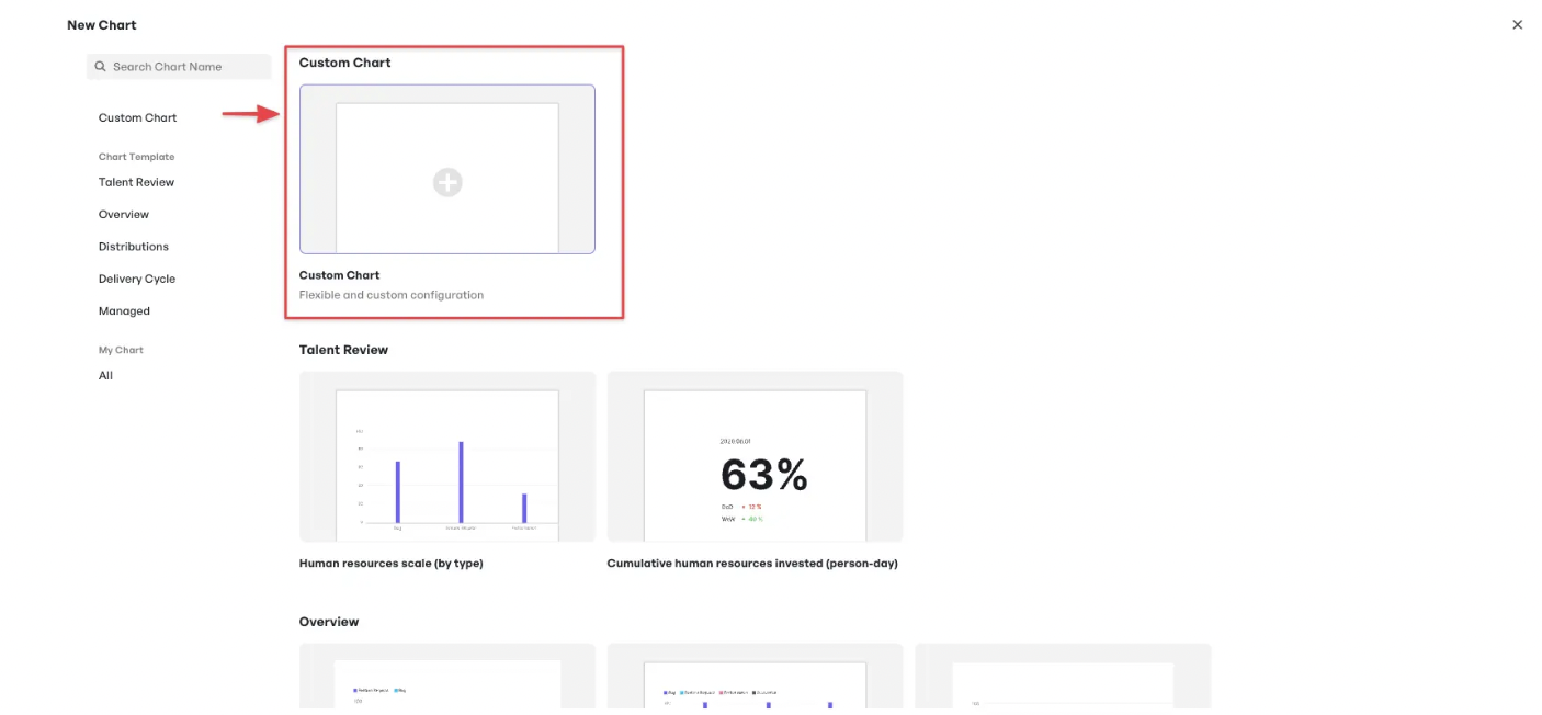
Name the chart. Select data source, data range (work item → feature), and chart type (histogram).
Set the filter condition: Completion Time is not empty.
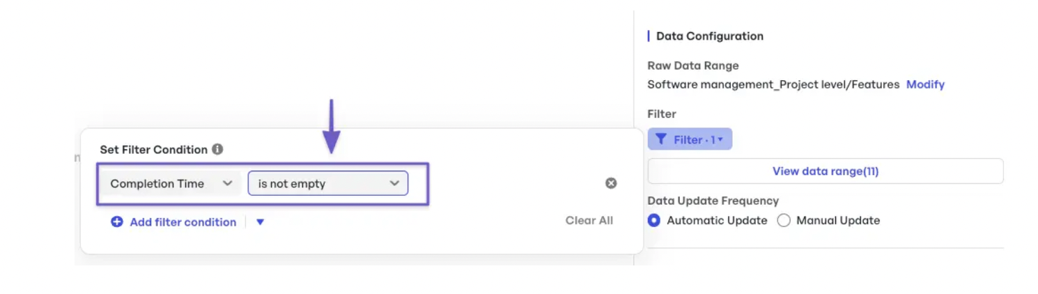
Step 2: Configure dimensions (x-axis)
Set ‘business line’ on the x-axis.

Step 3: Configure indicators (y-axis)
For the y-axis, click 'Add a field', name it ‘avg lead time’, and enter the formula:
To calculate in seconds:
AVG(Completion Time) - AVG(Submission Time)
To calculate in hours (divide by 3600):
(AVG(Completion Time) - AVG(Submission Time))/3600
Once created, you can schedule these reports using Meegle automation.
How to build a product management dashboard that works
Here’s a step-by-step guide on how to create a dashboard that supports decision-making and drives success.
Step 1: Define goals before building a dashboard
Ask yourself these questions to help clarify your goals:
- Purpose: What are you solving for—adoption, delivery, or something else?
- Outcome: What’s the tangible result—retention increase, revenue growth, smoother sprints?
- Success Metric: What does success look like (e.g., DAU, completion rate)?
- Team Relevance: How will this goal inform the team’s actions and decisions?
To define strategic goals, open Meegle’s OKR template and start from the Objective section. Create a new objective, then break it into multiple key results inside the Key Results tab.
 Measure progress, analyze influencing factors, and apply both confidence tracking and weighted scoring to each KR
Once your key results are in place, Meegle helps you track them with full visibility. Enter basic details, update progress, and analyze the factors affecting each result. Use confidence scoring and weighted metrics to measure progress accurately and remove the guesswork from your planning.
Step 2: Choose your metrics
Once you define your goals, the next step involves picking the right metrics that link effort to outcome. Each goal requires its own set of key performance indicators that clearly and accurately reflect product success.
Start by asking what data gives you early signs of success or signals the need to change course. If your goal is user adoption, track daily active users (DAU), monthly active users (MAU), or new user sign-ups. These metrics indicate how effectively users interact with your product and how frequently they revisit it.
Related Read: 👉Key Agile Metrics & KPIs for Measuring Team Performance
You need to understand which metrics act as leading indicators and which work as lagging indicators. Leading indicators help you anticipate outcomes, while lagging ones reflect results after they happen. If you're preparing for a new feature release, track feature engagement and user feedback to predict uptake. After release, shift the focus to retention rates and revenue to assess the long-term impact.
 Gain a competitive edge, fix inefficiencies, and move fast on new opportunities
Meegle supports this process through its Agile Development Template, which includes Epic, Story, Sprint, and Task views for detailed progress tracking. You can schedule tasks, manage delivery timelines, and monitor sprint health in one place.
Step 3: Structure your views based on the audience
Structuring views based on the audience ensures every audience gets tailored, relevant insights, without information overload.
 Configure chart for specific view in Meegle
- Product managers need detailed, real-time data to make tactical decisions, such as user engagement, feature usage, sprint velocity (to assess delivery trends), and customer feedback. Dashboards should focus on high-level metrics that inform strategic direction.
- Executives need high-level data reflecting overall product health and performance, focusing on strategic metrics like revenue, customer acquisition, churn, and business goals such as market share or brand positioning. Dashboards should feature trendlines and milestone highlights updated weekly.
- Developers need detailed views of sprint progress, task completion, blockers, and bugs. They track sprint velocity to identify blockers and optimize throughput, alongside task completion rates, bug reports, and backlog status. Make sure their view highlights progress in real-time, with tools to track tickets, issues, and progress against deadlines.
- Marketing and customer support teams need to track user feedback, marketing campaign performance, and customer interactions. Focus on user sentiment, support tickets, feature requests, and social media feedback. Real-time data on customer interactions will help them engage with customers more effectively. For example, if feedback spikes after a feature launch, support can prepare responses while marketing adjusts messaging.
Step 4: Connect your data sources
Nothing slows a product team down like disconnected tools. Without unified data, insights stay buried in silos.You need to pull in data from multiple systems, like analytics, task management, version control, and support platforms.
") One dashboard to track features, versions, goals, and analytics in Meegle (for each template)
One dashboard to track features, versions, goals, and analytics in Meegle (for each template)Meegle helps unify task tracking, goal tracking, and custom dashboards for progress updates, so you don't have to jump between different tools.
Step 5: Set up regular check-ins or async reviews
Finally, establish a cadence of reviews, either live or async, to track progress and realign priorities. These reviews help you recognize milestones and team achievements to maintain motivation and transparency. Daily stand-ups can be useful for tracking sprint progress, while roadmap reviews ensure alignment on long-term goals.
Whether you’re meeting live or async, Meegle keeps everyone updated with live task views and progress tracking. For async updates, team members can comment directly in Meegle, ensuring feedback stays in context.
Meegle in action: How Skylink Studio transformed its game delivery
Skylink Studio, a leading game development company in Vietnam, faced challenges in managing its creative ideas and translating them into successful game launches. Despite having a wealth of innovative concepts, the company struggled with coordinating tasks, tracking progress, and maintaining alignment across its 50-person team working on multiple projects.
Here’s how Meegle transformed Skylink Studio's approach to game development by introducing clarity, organization, and actionable insights.
Organize structure with a centralized roadmap
 Skylink's product roadmap with Meegle's Tree View
Meegle's tree-view and panorama view features provided Skylink with a structured framework for their flagship project, MagicSwap App. The roadmap broke down the project into manageable levels.
- Top level: The overarching project (e.g., Holiday Gifts: Christmas Special)
- Sub-levels: Versions (e.g., Android V6), sprints (e.g., Kanban), and epics (e.g., Christmas Challenge)
- Actionable tasks: Features like 'Update Christmas Assets' were divided into smaller tasks such as 'Upload Photos', 'Style Selection', and 'Error Handling', with clear differentiation between frontend and backend responsibilities.
This centralized structure kept the team focused on creating exceptional games while maintaining alignment at every step.
Transform project management with Meegle's visual workflow
Meegle's visual workflow transformed project management into an intuitive, actionable roadmap. Starting with key tasks like preparing design documents and creating user interfaces, the system ensured foundational steps were completed before advancing to development phases, minimizing delays and maintaining a smoother transition to later stages.
 Skylink's visual workflow for Toy Triple
Each task had a designated owner, providing clarity on responsibilities and the broader impact of their work. Automated notifications kept everyone focused, eliminating confusion about priorities.
 Automated notifications to keep everyone on track
Get faster results with dynamic charts
 Track project status in real time with charts
With Meegle's dynamic charts, Skylink could track project completion status in real-time and pinpoint exactly where work stalled on a specific project. Key visualizations like the '% Progress of Implementing Feature' and 'Monthly Features Volume' charts revealed how close each game was to launch readiness.
Charts highlighting 'Bug Closed Status' and 'Ongoing Bug Trend' enabled the team to quickly identify areas requiring attention, reallocate resources, and prioritize fixes to prevent unnecessary delays.
This way, Meegle's features made it easy for Skylink to visualize everything in one place. Having a clear view of product usage analytics, the project's progress, and the goals they were working toward allowed the team to make informed decisions and act quickly.
As Khiêm Trần, Project Manager at Skylink Studio, put it:
"Meegle has been a game-changer for our projects. I love how its features make it easy to visualize everything in one place. It’s incredibly helpful to have a clear view of the project’s progress and the goals we’re working toward, allowing everyone on the team to stay aligned and focused."
Improve performance with Meegle's product management dashboard
Pulling product data from multiple tools and spreadsheets slows teams down and creates confusion across workflows. Meegle simplifies this by offering visual workflows, customizable dashboard templates, and real-time insights into everything from roadmap progress to resource scheduling. You can manage capacity, track KPIs, and adjust timelines all within one connected space.
Teams collaborate directly within Meegle using comments, file sharing, and automated updates, eliminating the need to switch between apps. Instead of fragmented reporting, you get a complete picture that helps you respond quickly and keep projects on track.
Discover how Meegle makes product management visual, agile, and effortless—use it today.
FAQs
What tools are best for product management dashboards?
The best tools for product management dashboards include Meegle, Jira, Asana, Monday.com, and Trello. These tools offer customizable workflows, visual dashboards, and features like task tracking, team collaboration, and progress monitoring.
How often should dashboards be updated?
Dashboards should be updated regularly, ideally in real-time or at least daily. This ensures the data reflects current progress and any changes to the product or project. The frequency may depend on the pace of your product’s development and the specific needs of your team.
Can non-PMs benefit from viewing the dashboard?
Yes, non-product managers can benefit from viewing the dashboard. Stakeholders, marketing teams, and engineers can use it to stay informed about product progress, priorities, and timelines. Having access to a real-time overview allows them to make better decisions, communicate more effectively, and align their efforts with the product's goals and development status.
The world’s #1 visualized project management tool
Powered by the next gen visual workflow engineStart creating impactful work today